UberDroidBlog
Search This Blog
Monday, May 18, 2020
Construct 3 / Construct 2 Template available from the Scirra store here!
Wow it's been a long time!
I've been busy working on my template version 2. (Free update for anyone who has the template)!
Right now it's just for Construct 3 but it has so many new features. The most exciting is textured floors and ceilings. They don't line up 100% perfectly though. Sometimes when you turn they appear to slide in relation to walls. It's pretty subtle and definitely looks good! but it's just not rock-solid.
Now you can easily change the resolution. I have a function to switch it from 128 to 256 rays. More than that won't help much unless you change the resolution of your wall textures.
But that's the beauty of this template. You can add ANYTHING YOU WANT!
There are more weapons, and a switching system, mouse lock for Construct 3, faster rendering and so much more!
Version 2 is only for Construct 3 right now, but it comes with the original template. Anyone who bought the template can download the update.
Wednesday, May 9, 2018
The official 7DRL reviews are in, or Turncoat Tomb and the Goblet of McGuffin
Turncoat Tomb results are in!
First I'm grateful for the feedback. Thanks so much to the review team that's a huge effort!
Overall my game scored 50th place out of 120+ entries so not bad, but not really where I was hoping to be.
The reviews were very fair and humblingly thoughtful. They say a lot about how great the #roguelike #7DRL community is! With this and other reviews I've read, they're not only consistent but really thorough given the ground they had to cover.
Scope | #18 | 3.000 | 3.000 |
Roguelikeness | #20 | 3.667 | 3.667 |
Innovation | #26 | 3.000 | 3.000 |
Completeness | #36 | 3.333 | 3.333 |
Aesthethics | #47 | 3.000 | 3.000 |
Overall | #50 | 3.056 | 3.056 |
Fun | #84 | 2.333 | 2.333 |
In Scope, innovation, Roguelike-ness I'm averaging near the top 20 so I can't complain.
What drug the game down were the two most subjective and hard to pin down aspects: Aesthetics and fun. Fun is the most important, and my worst showing --so I'm not gonna lie, that one hurts. Mostly because it's true, but they also gave me a relatively easy way to fix it! So let's take a look:
FUN
I think in the first 10 or so floors, the game delivers a lot of fun moments. For example when you lead a monster into an opposing area and switch to its color letting it destroy your new enemies, or get an randomly irresponsibly OP hammer and wipe out a level or 2 like wheat to your scythe or have nothing but a 0 strength grey coat left and barely elude some one-more-hit-will-kill-you undead only because it paused to take a swipe at a lowly unlucky red grunt. Those moments can be very satisfying.However, these moments can't sustain fun all by themselves for very long. They kind of repeat or "run out" once you've seen a lot of them. And with no special items and only a few weapons those interactions are very limited.
But the biggest obstacle dragging my score down seems like it can be summed up in this selection from the judge's comments:
If there is a goal I couldn't find it."
"...no win condition was stated in the instructions.."
"With no apparent goal it seems pointless."
|...And with no goal in mind, I didn't feel motivated ...."
"...no win condition was stated in the instructions.."
"With no apparent goal it seems pointless."
|...And with no goal in mind, I didn't feel motivated ...."
It would have been that easy.
Goblet of McGuffin
I might do just this. Something more appropriate for my theme, but yeah why not. It would be easier to frame the game that way and manage progression if it had a limited number of floors.
I always envisioned but never had time for bosses and, sub goals that give the player powers like better hand attacks, immunities to things and so on, and an "evil otto" type invincible floating spectre chasing you to push you along instead of a hunger clock because I hate hunger clocks. I will have a win state though even if it's a really simple superficial one.
So for my next release: Here's the prize you're after:
I give you... THE TURNCOAT
As long as it's charged it will act as all colors (except shadow) has ludicrous armor class and whatever else I can think of. You will need the Turncoat to escape the tomb.
So for my next release: Here's the prize you're after:
I give you... THE TURNCOAT
As long as it's charged it will act as all colors (except shadow) has ludicrous armor class and whatever else I can think of. You will need the Turncoat to escape the tomb.
ASTHETICS
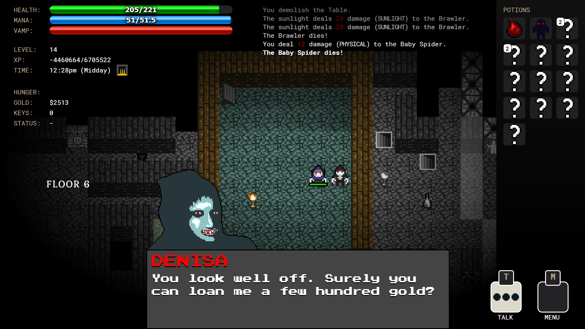
I spent a lot of time developing a consistent pixel art style and mood. From the blood to the myst from the undead altars, to the window lighting there are a lot of details to hopefully support the mood and theme of the game.
For example if an attack hits near a wall, the blood splatters differently to appear "on the wall" and actually runs down and there are different kinds of swipes for different weapons and bites. Plus one reviewer said it was one of the best UIs this year.
Still 3/5 ain't bad I guess. . The lower percentage overall just means that a lot of games had good aesthetics according to their judges and it seems like most people didn't like the screen rotation. I'll get into that below.
THE ROTATION
Some of these I've already changed. I upped the camera speed / light updates which are just variables so I just changed a couple of numbers and added an options screen:
People didn't seem to like it, so by default it's almost off... it's very subtle now unless you crank it up so I left that as an option. I also made the LERP adjustable but very fast by default so the camera won't have to "catch up" but it's also not instant which is really abrupt and jerky to me. Most modern games lerp the camera to some degree. I think I just had it too slow in the judged version.
The light updated only every second which for a turn based game I didn't think would matter. Apparently it does, so I updated it 4 times a second, and I added an extra lighting update "on the turn" so there is no delay at all. So no more delays.
So if you like a really smooth camera and perspective effect like I do, you can turn them up. Otherwise if you're getting motion sickness or your'e a soulless monster who hates anything different (I kid I kid), you can turn them down or off. They are very subdued from where they were by default. I turn them up full blast when I play, but that's just me. Maybe I'm the only one.
I will keep working on the game because I really believe in the premise as an engine for emergent fun and I will continue adding more possibilities until it's a legit commercial quality game.
I'll respond now to the comments directly in detail:
- I played versions 1.0.1.2 and 1.0.1.3. If there is a goal I couldn't find it. I got to floor 19.
Scrolling zooms the map in/out.
Agan HOLY CRAP you got to floor 19? I'm not kidding I made the game and I don't think I've EVER got to floor 19. But then there were times I might have but stopped because I was testing... still I have so much respect for this review!Completeness 3
Depositing gold from above an altar causes the gold count to flicker but seems to have no other effect.
When you donate there's a moment where the gold "drops" into the altar. During this real time event, you can run above the altar and grab it back --and a monster can grab it too before it goes in if they get a turn. So you can't donate to altars from the north side of them --you just can't. I could fix this, but then you would always donate from the North side.
It's a conceit of the game which may or may not be worth the counter intuitiveness but I plan to implement more real time stuff. For example you can actively "dodge" spider webs in real time by moving in turns fast enough, and I'd like the spectre of turncoat tomb that pushes you to complete floors to violate the turn system too and just float toward you in real time.
Enemies will sometimes disappear despite being in the light.
The problem is line of sight is calculated from one player's center to the other enemy's center. You should intuitively be able to see a part of a monster around a corner even though maybe your center couldn't see their center. I can probably think of ways around this but just haven't.
Maybe I should just make visible be "in the light" as in touching a lighted area...holy crap that just might work actually!
If there is a goal I couldn't find it.
It was on floor 20 I'm tellin' ya! You were so close! Just kidding it was more of the same!
Yeah this kind of Roguelike needs some goals. I'm convinced even just a useless nominal McGuffin item on a high floor and a "congratulation" message indicating a win state would have improved the "fun" rating drastically and been so easy to implement it's maddening. I'm working on goals for the game.Aesthetics 2
WASD to move. I wish you could move with arrow keys as well.
Wish granted. I thought I already had arrow keys by that version, but I guess it was later... Have to look at my dev log.
The rest command passes multiple turns. Walking into walls passes one turn, so this is not a tradeoff, just a one time gotcha.
I fixed the rest a lot. Space does one turn. Holding the R key rests until a hostile monster is near the player. No more danger in resting. I don't know though I like that little risk. I wonder if maybe whether you "wake up" depends on an ability and there's a chance you'll get killed by a monster in your sleep if you're holding R and getting a free heal.
Tiles sometimes overlap so that what looks like a wall is actually walkable floor space.
There is a long delay before stats get updated, a long delay before lighting gets updated, and a long delays as the map scrolls to catch up with the player character. It is visually unappealing and makes the game annoying to play.
All of that is better. I made the tall walls a little shorter to not completely block the floor on the other side.. I didn't want to sacrifice the aesthetics of the tall walls though.
All good observations. Even in the judged version walls become transparent when any enemy or the player is behind them.Fun 2Slow moving, especially with the game's delayed reaction to everything.Decisions about when to run and what altars to support.With no apparent goal it seems pointless.Innovation 3
Different enemy factions fight each other.Scope 3A few enemy types and weapons.
My next release doubles the number of enemies.
Wide open or room and corridor maps.Roguelikeness 4
Turn/grid based
Random maps
Permafailure
RPG stats and weapons
This is a great review ... very thorough and thoughtful. And floor 19! Hats off! - On my best run of this game, I got to level 12. I decided not to keep trying after about 45 minutes of play because later levels seemed to just be more of the same, and no win condition was stated in the instructions.
There it is... man I hear that "win condition" thing loud and clear. Next release I swear there's gonna be a win state if it kills me.I think this is a promising concept, but I didn't feel like the factions did much for me in practice. I felt like I could only take a couple of strategies:- Switch colors every time I saw a differently colored monster
- Fight everything to gain XP and become a badass, ignoring the faction mechanic
Of course, #2 is why I eventually died, but #1 isn't really a fun mechanic for me. And with no goal in mind, I didn't feel motivated to optimize for making it to a certain level.
I'm beginning to see a pattern here...So while this isn't a standout entry to me, I did feel like it was worth my time to try out.CompletenessPolished, balanced, no bugs that I could see. 4/5.AestheticsIntuitive UI, good-looking, nothing weird or out of place. Definitely one of the best UIs this year. 4/5
FunDifficulty was bimodal for me. Either I died on the first level, or I was good to go for a long time. The level 1 enemies seem really unbalanced.
That's true! Since then I gave the player a really basic sword instead of just bare hands on the first level. That really helps the balance on the first level. You can still die, but you have a much better chance.I never felt like I was able to predict how hard a fight would be before I had either already killed the enemy, or was in deep trouble.It seemed like some of the armor was better than the other armor but I wasn't able to swap it out to see if I already had full armor slots.
You can swap now. I had trouble implementing dropping armor for that version. It works now. The trouble was it kept treating armor like weapons in ways it wasn't supposed to. It works now though you can swap armor except grey which is your "default."So given the blandness of the melee combat, balance issues, and not feeling like the factions mechanic was fun for me, I'm going for a 3/5 here.
Still not too bad! The combat could use some more weapon types. Maybe magic of some kind for the player but I'm committed to not having any offensive spells. All "tricks" are to manipulate monsters and their behavior.InnovationA neat twist on the usual mechanics. In practice doesn't seem to have a huge effect, so 3/5.ScopePretty much what you'd expect from a 7DRL. 3/5RoguelikenessIs clearly a roguelike. 4/5
Three 4s from this judge! And great constructive feedback! Thanks! I give this review 5/5! - Strange game... It's really hard to understand what's going on. As far as I can tell, there are enemies of different colors and coats of different colors. You can switch coats and enemies of the same color as your own are fighting for you. In theory this could be fun. But implementation... Spinning view makes me dizzy. It's often hard to see what's going on. Coats are rare. You can easily die before you even find a new coat. Monsters do not easily leave area of the altar of their color. So luring differently colored enemy to a monster of your color is very cumbersome. Line of sight calculation is very bugged. It is somehow delayed and it's easy to miss a turn because it's not immediately visible.
I think I fixed a lot of the things that are bugging this judge. Spinning is better just a quick thing at the beginning of a run and the tilting perspective is adjustable and much less by default. Also you now get ep for "team kills" so the faction mechanic matters a lot more.
This judge didn't put the scores in the comments but I can tell by math based on the other 2 judges scores if my math is right:
Completeness 3
Roguelikeness 3
Scope 3
Innovation 3
Aesthetics 3
Fun 2
Just the goal, and a little more monster interaction overall would have gone a long way. Really good feedback all around!
Saturday, April 21, 2018
Turncoat Tomb: Going Down!
When making Turncoat Tomb I originally wanted to go up and down stairs, but this was way too hard for me to do in a 7drl time limit. The unfortunate byproduct of this was I made my whole game from that point on with a framework that didn't support persistent dungeon floors.
You go up the stairs and the last dungeon floor is gone forever.
This is fine for a 7drl but it leaves out a lot of game play possibilities that I really wanted to have in the game, like fleeing upstairs from strong or out of depth monsters then coming back when you're stronger and beating the crap out of them. Or having things on lower levels you can't get to but on level 5 you find something that lets you get to it. That sort of thing.
BUT HOW?
The easiest, laziest way possible. Just make objects not on your floor invisible and leave them out of game mechanics. Boom. Now you can build 10 floors but it will only show the stuff on your floor. No need to store anything, or re-build dungeon floors or anything complicated like that.
It has the added advantage of having all the entities on all floors there all the time. Some maybe minor interactions could happen on floors you're not on or more easily be able to chase you from floor to floor.
But whenever you "tack on" a big thing like that, there are issues. For example I would see monsters on floor 2 that should be on floor 1. Like ghosts, they just sit there and are intangible because I 'leave them out" of game mechanics, but there they are. This is because I had a line of sight function that hid and revealed monsters if they were behind walls or not. That function wasn't floor savvy so it would "reveal" monsters I had line of sight to on wrong floors.
There's bound to be stuff like that when you add features late in development without starting over, but I think I got it licked.
I can now go upstairs to higher floors without destroying the lower ones, and it seems to work seamlessly and with no side-effects of having all the lower floor objects still exist.
Another fun side effect of this is now I can have basement levels! I chose to progress UP instead of down so I could keep those cool stained glass windows. But now I can have basement and cave levels so more variety is possible.
You go up the stairs and the last dungeon floor is gone forever.
This is fine for a 7drl but it leaves out a lot of game play possibilities that I really wanted to have in the game, like fleeing upstairs from strong or out of depth monsters then coming back when you're stronger and beating the crap out of them. Or having things on lower levels you can't get to but on level 5 you find something that lets you get to it. That sort of thing.
DOWN STAIRS! |
The easiest, laziest way possible. Just make objects not on your floor invisible and leave them out of game mechanics. Boom. Now you can build 10 floors but it will only show the stuff on your floor. No need to store anything, or re-build dungeon floors or anything complicated like that.
It has the added advantage of having all the entities on all floors there all the time. Some maybe minor interactions could happen on floors you're not on or more easily be able to chase you from floor to floor.
But whenever you "tack on" a big thing like that, there are issues. For example I would see monsters on floor 2 that should be on floor 1. Like ghosts, they just sit there and are intangible because I 'leave them out" of game mechanics, but there they are. This is because I had a line of sight function that hid and revealed monsters if they were behind walls or not. That function wasn't floor savvy so it would "reveal" monsters I had line of sight to on wrong floors.
There's bound to be stuff like that when you add features late in development without starting over, but I think I got it licked.
I can now go upstairs to higher floors without destroying the lower ones, and it seems to work seamlessly and with no side-effects of having all the lower floor objects still exist.
Another fun side effect of this is now I can have basement levels! I chose to progress UP instead of down so I could keep those cool stained glass windows. But now I can have basement and cave levels so more variety is possible.
Wednesday, March 28, 2018
My 7Day RogueLike Dev Blog on the 7drl site
TURNCOAT TOMB 7DayRL Completed... But still updating...
Play the latest version here:
Here is a copy of my development log from the 7drl blog: which you can either read here (below) or here (with pictures)
It's just basic comments I made after each day or so of development. Development did not stop there, though. It went on and is still going on...
Day 1
I’ve coaxed Construct 2 to act in a “turn based” kinda way with mid-turn animation so the player and monsters (whatever moves) kind of “hops” from tile to tile.
Did some of the pixel graphics ahead of time.
Now tackling persistent dungeons and overall framework.
I hope to get a working playable but empty game with title, really basic menu and 6 pcg dungeon levels you can move up and down persistently.
Basic monster graphics is done for all the colors (3 monsters each), Including the undead faction.
For more info on Turncoat Tomb check out my blogspot posts:
Anyhow break is over…
Day 2
So far a little slow going. I’m not where I wanted to be, but hoping for that night time boost I always get.
My method of dealing with development challenges so far can be summed up with this joke:
Patient: “Hey Doc, it hurts when I do this…”
Doctor: “OK so don’t do that.”
If thine feature offend thee, pluck it out!
It might be called Turncoat tower because you’re actually going up rather than down stairs.
–and for now it’s a one way trip–
Don’t have time to make dungeons persist and allow going back to previous levels.
So far I’m pretty happy with the graphics! I very quickly threw together the pixel-art-style sprites. I’m using Construct 2’s built in sprite editor pretty much exclusively for my tiles and entities, along with lighting effects.
Dungeon generator is done (minus items like my nifty animated torch).
All entity graphics are done. Opening screen is done. Animated turn based movement is done for player and monsters.
Now for the inventory, level and health, items, targeting and attack mechanics.
Just to show where my head’s at I have a family called “FnEverything”
Guess which objects are in that object family…
Day 3-4
I have basic meelee combat added and the beginnings of an inventory system.
I’ve added “altars” one for each faction. These have a certain number of total points and for each monster they put out they use up so many turns. You can see them counting down to the next monster.
Altars will be where you can bring gold to get weapons of that monster color and buy favor with that faction, But only if your coat is that color. that lets you join that faction. The grey “human” altar just gives you ep (like Sword of Fargoal) and blesses your grey weapons.
Meelee combat produces blood splatters that I’m very pleased with! It’s no accident that no matter what color the monster is, they all bleed red (except undead).
Also walls become transparent if creatures get behind them.
Day 5
Stop Hitting Yourself!
I had an interesting bug come up yesterday which I called “Stop hitting yorself… stop hitting yourself… why are you hitting yourself?”
Turns out if you program your player to automatically attack anything you bump into, then make the space bar do the standard “rest” thing where you don’t go in any direction… guess who you bump into! YOURSELF!
My friend who is a biologist interestingly said, “This is a perfect video game analogy for autoimmune disorders. Just saying. Am not a nerd in multiple dimensions- am not!”
It was easily fixed but I did spend a good 10 minutes or so having fun with it and it may turn into a “feature” like a curse or something. Actually it’s a perfect curse for this game because the theme is all about manipulating the behavior of your fellow denizens –turning them against each other and themselves or rallying them to help fight the real enemy which is the undead of the tomb.
It’s hard to get momentum… to get going. I put it off by writing things… I’m doing it right now.
Another thing that hinders progress and puts completion at risk is my tendency to add unnecessary but still awesome effect and then spend a ton of time perfecting them instead of adding essential game mechanics.
The blood effect is beautiful if I do say so myself.
OK Back to it…
Day 6
Targeting based on hate levels works!
When wearing a red coat I no longer target the red monster but the green one. When my color switches, it picks the appropriate target. This is for monsters based on how much each color hates each other color. You will target whoever you want provided they’re not your color. Monsters will pick a monster of whichever color they hate the most within their line of sight to attack.
Monsters can’t attack their own color and you need to be wearing the appropriate coat to get or use their color weapons and such. Note: I still haven't added other color weapons...
Day 7
Well here it is all done!
I PULLED IT OFF! I can’t believe I did it!
I am beat! This was very intense.
Turncoat Tomb
Four coats to turn to and 2 glorious weapons slots.
I did all of the the game graphics every bit in Construct 2’s sprite editor from scratch.
I had to give up a lot of things I wanted to put in, but this is a very fun and complete game. The thing is, as you go up the tower, the undead get tougher way faster than the rest of the monsters or you. So the only way to survive is to slowly make frenemies with the color monsters so they will help you or at least not bother you against the living dead of the tomb. To do this you need to turn your coat as the name suggests.
ASDW directions. Have fun it’s right here:
https://uberdroidgames.itch.io/turncoat-tomb
Here’s the description I put on itch.io:
Around the levels there are coats. When you get one you can switch to it and those monsters will leave you alone. There are different colored altars that push out monsters. Grey altars give you weapons and health when you put gold in them.
Other colored altars accept donations in exchange for that color hating you less. When you drop gold in them (10gb at a time) a number form 1-10 floats out indicating their animosity toward you (whatever color coat you’re wearing).
The crypt altars will give you nothing but pain and they will always hate all life. But they’ll take your gold anyhow and who knows? Maybe they will ask you join them.
It’s played entirely with the A S D W keys for direction. Mouse click on coats and weapons to equip them.
Once you’re dead, the game reloads.
Sometimes it’s hard as… well it’s a Roguelike that’s for sure!
Monday, February 26, 2018
7DRL: Turncoat Tomb --About those dungeons
2018 7DRL only DAYS AWAY. I'm so excited I just can't hide it.
Since it is within the rules to use commercial or 3rd party graphics, build on pre-made game engines like the T engine, or even build on previous projects, I'm using some of the tech I developed when experimenting for my book Let's Make a RogueLike with Construct 2.
The dungeon is a grid of tiles that are 32x32. I made several generic dungeon generators for the book in hopes of explaining different ways to do PCG levels.
My first example of a "procedural level" was with a "pillar and wall" maze generator similar to how Berzerk mazes are made. I explained this in my "Roguelike maze" tutorial on Scirra's site:
Rogue-like-random-maze-tutorial-pt-1
This is a very easy and super fast kinda maze algorithm. It can give you labyrinthine hallways and sort of room like areas. If you want a pcg level in a hurry it's a good way to go.
This was meant to be short, easy to understand, and maybe help someone get started with really basic PCG in Construct 2.
At the time I was very naive and not as sophisticated in my approach to making pcg levels.
In the tutorial (and in subsequent ridiculously convoluted attempts) I made levels by placing wall and floor sprites on the layout, then checking for where these sprites are with "feeler" objects checking for collisions, then adjusting things accordingly.
There are a couple of big problems with this approach:
If you put a sprite down, say a wall, then check to see if there's a wall there, Construct will think there is no wall there.
I didn't know it at the time, but Construct 2 waits until all the events are done and a tick happens and the screen is updated before the sprites you just created are really "there" for collision checks. You can say "wait 0" and THAT EVENT ONLY will wait a tick so anything in THAT EVENT ONLY will then see your new floor or wall or whatever if its checking for collisions.
Notice how I keep saying THAT EVENT ONLY in rage caps? To take advantage of the tick that happens after a wait action, you have to have your checks in events that are in that same event tree further down.
Other events don't give a crap about your wait command and will go on their merry way like nothing happened... so in those events, your collision checks won't work.
This led me to make some ridiculous chains of "make a floor, wait, check for floor, do something if there is one, something else if there's not, make a wall or something, wait, check for walls and floor do something else make another floor wait again..." It started to get really ugly because all these waits have to be in the same event. God forbid I call a function or have a loop or something.
The fact that wait works this way is actually really awesome. It's a good way to have it set up for most situations, but it's no fun for trying to build a level.
Furthermore if you have a big level with hundreds of sprite tiles and you have to do a bunch of nested collision checks and stuff, things start to get really slow. Building a very simple"Rogue" sized level can take almost a minute which is hours in waiting to load time. And that's without any game objects.
Also it tended to make redundant floors and walls over each other which happens when you're throwing stuff around random -willy-nilly. It required some clean-up which was more collision checks in nested waits or with timed triggers or something.
Digger method:
Intuitively I thought a good way to make levels was with what I later learned was called an "agent based" or "digger" method. I have a little guy pop up rooms, turn a random cardinal direction, move a random amount (while making a hall) then pop up another room. When our little room digger gets too close to an edge of the boundary, I have it turn back.
The idea was good, but the execution was a mess.
The solution is just to add an extra step and make your level in a two dimensional array, then once the array is done building, have the game draw the level with sprites. No sprite collision checks needed. All the thinkin' is done on the array.
1 build your level in an array
2 have a generic array-to-level draw routine.
This way no matter how you build your array, your "draw dungeon from array" routine should work the same.
Also it's fast as sh@$.
I returned to the tried and true method, similar to the one used in the original Rogue.
It uses a tic-tac-toe grid and in random squares of that grid it makes random rooms... then makes halls between them. You end up with the same looking dungeons as the digger method, but there's more control.
It's easy to see what's going on here. The problem is it's kinda boring. The dungeons are similar and you just have rectangular rooms. With the digger method you have more unpredictable shapes because the thing digs rooms out on top of other rooms.
So I just added a loop to make a number of random rooms on top of the initial random rooms.
With some tweaks in the parameters, I can easily set my dungeons to "Extra Chunky (tm)" Extra chunky = extra fun! All the control of the boring dungeon, but none of the boring.
This is how fast it can generate complex dungeons in real time. (The top is slowed down a lot).
The "chunky" ones look like playable levels in a more modernerish game. Yes "modernerish" is a word. It is now. You're welcome, colloquial English.
Instead of taking 30 seconds to make a level you can make the same level 10 times a second. At least. Turns out it's a LOT faster to check numbers in an array than it is to check sprite geometry collisions on a layout.
Also there's less clean up because one value in an array can't be 2 overlapping things (unless you want it to --which I'll explain below).
A bit about my generic level array:
If you want more than just one thing on a given square --for example maybe you want a floor and a door or a wall and a torch sticking out of it... you will need to have more than one value in the same "area" in your level. To do this you might want a 3 dimensional array instead of just x and y so you can stack values in each spot.
This seems like over-kill since most squares in say a 200x200 or 40,000 square dungeon will just have a wall, a floor or nothing. Every step in the third dimension is another 40,000 values of mostly thin air. That's a whole lotta nothin' going on.
What I did was keep just a 2 dimensional array, but use bit values. Bit 1 is a floor or not, bit 2 is a wall or not, bit 3 is a door or not...and so on. This gives me the freedom to have any combination of 8 different things with a single number from 0 to 255.
To be continued:
Since it is within the rules to use commercial or 3rd party graphics, build on pre-made game engines like the T engine, or even build on previous projects, I'm using some of the tech I developed when experimenting for my book Let's Make a RogueLike with Construct 2.
The dungeon is a grid of tiles that are 32x32. I made several generic dungeon generators for the book in hopes of explaining different ways to do PCG levels.
My first example of a "procedural level" was with a "pillar and wall" maze generator similar to how Berzerk mazes are made. I explained this in my "Roguelike maze" tutorial on Scirra's site:
Rogue-like-random-maze-tutorial-pt-1
This is a very easy and super fast kinda maze algorithm. It can give you labyrinthine hallways and sort of room like areas. If you want a pcg level in a hurry it's a good way to go.
This was meant to be short, easy to understand, and maybe help someone get started with really basic PCG in Construct 2.
At the time I was very naive and not as sophisticated in my approach to making pcg levels.
In the tutorial (and in subsequent ridiculously convoluted attempts) I made levels by placing wall and floor sprites on the layout, then checking for where these sprites are with "feeler" objects checking for collisions, then adjusting things accordingly.
There are a couple of big problems with this approach:
If you put a sprite down, say a wall, then check to see if there's a wall there, Construct will think there is no wall there.
I didn't know it at the time, but Construct 2 waits until all the events are done and a tick happens and the screen is updated before the sprites you just created are really "there" for collision checks. You can say "wait 0" and THAT EVENT ONLY will wait a tick so anything in THAT EVENT ONLY will then see your new floor or wall or whatever if its checking for collisions.
Notice how I keep saying THAT EVENT ONLY in rage caps? To take advantage of the tick that happens after a wait action, you have to have your checks in events that are in that same event tree further down.
Other events don't give a crap about your wait command and will go on their merry way like nothing happened... so in those events, your collision checks won't work.
This led me to make some ridiculous chains of "make a floor, wait, check for floor, do something if there is one, something else if there's not, make a wall or something, wait, check for walls and floor do something else make another floor wait again..." It started to get really ugly because all these waits have to be in the same event. God forbid I call a function or have a loop or something.
The fact that wait works this way is actually really awesome. It's a good way to have it set up for most situations, but it's no fun for trying to build a level.
Furthermore if you have a big level with hundreds of sprite tiles and you have to do a bunch of nested collision checks and stuff, things start to get really slow. Building a very simple"Rogue" sized level can take almost a minute which is hours in waiting to load time. And that's without any game objects.
Also it tended to make redundant floors and walls over each other which happens when you're throwing stuff around random -willy-nilly. It required some clean-up which was more collision checks in nested waits or with timed triggers or something.
Digger method:
Intuitively I thought a good way to make levels was with what I later learned was called an "agent based" or "digger" method. I have a little guy pop up rooms, turn a random cardinal direction, move a random amount (while making a hall) then pop up another room. When our little room digger gets too close to an edge of the boundary, I have it turn back.
The idea was good, but the execution was a mess.
The solution is just to add an extra step and make your level in a two dimensional array, then once the array is done building, have the game draw the level with sprites. No sprite collision checks needed. All the thinkin' is done on the array.
1 build your level in an array
2 have a generic array-to-level draw routine.
This way no matter how you build your array, your "draw dungeon from array" routine should work the same.
Also it's fast as sh@$.
I returned to the tried and true method, similar to the one used in the original Rogue.
It uses a tic-tac-toe grid and in random squares of that grid it makes random rooms... then makes halls between them. You end up with the same looking dungeons as the digger method, but there's more control.
It's easy to see what's going on here. The problem is it's kinda boring. The dungeons are similar and you just have rectangular rooms. With the digger method you have more unpredictable shapes because the thing digs rooms out on top of other rooms.
So I just added a loop to make a number of random rooms on top of the initial random rooms.
With some tweaks in the parameters, I can easily set my dungeons to "Extra Chunky (tm)" Extra chunky = extra fun! All the control of the boring dungeon, but none of the boring.
This is how fast it can generate complex dungeons in real time. (The top is slowed down a lot).
Mmmmm. Chunky. |
The "chunky" ones look like playable levels in a more modernerish game. Yes "modernerish" is a word. It is now. You're welcome, colloquial English.
Instead of taking 30 seconds to make a level you can make the same level 10 times a second. At least. Turns out it's a LOT faster to check numbers in an array than it is to check sprite geometry collisions on a layout.
Also there's less clean up because one value in an array can't be 2 overlapping things (unless you want it to --which I'll explain below).
A bit about my generic level array:
If you want more than just one thing on a given square --for example maybe you want a floor and a door or a wall and a torch sticking out of it... you will need to have more than one value in the same "area" in your level. To do this you might want a 3 dimensional array instead of just x and y so you can stack values in each spot.
This seems like over-kill since most squares in say a 200x200 or 40,000 square dungeon will just have a wall, a floor or nothing. Every step in the third dimension is another 40,000 values of mostly thin air. That's a whole lotta nothin' going on.
What I did was keep just a 2 dimensional array, but use bit values. Bit 1 is a floor or not, bit 2 is a wall or not, bit 3 is a door or not...and so on. This gives me the freedom to have any combination of 8 different things with a single number from 0 to 255.
To be continued:
Sunday, February 11, 2018
7Day Roguelike 2018: Turncoat Tomb
2018 7 DAY ROGUELIKE CHALLENGE!
https://itch.io/jam/7drl-challenge-2018
If I'm going to write a book on how to make a roguelike using Construct 2, well then I should be able to make a Roguelike using Construct 2 in 7 days and succeed in the 7DRL challenge or else why would anyone want to read my book?
I have been heavily inspired by the game Golden Krone Hotel. One of the things that makes it fun is the idea of factions --Vampires vs Humans.
You can be attacked by a horde of vampires in the middle of bloody combat, then drink some vampire blood and suddenly they'll stop attacking you. Oh you're one of us! It's all good! No hard feelings! And they even talk to you saying things like:
"I killed a man once... Couldn't kill him twice!"
...but then humans will attack you because you're a vampire. I love that whole really simple factions angle and plan to really lean into it with my 7DRL.
What is glaringly missing in this is the fact that human and vampire npcs never attack each other! It's just you for some reason.
I figure NPC humans and vampires don't attack each other because of some pact... kind of like the Continental Hotel in John Wick movies.
This is where another one of my big influences comes in. A much older one:
CROSSROADS for the Commodore 64.
Now THESE enemies kill the hell out of each other! In fact the first minute of each round is mainly just staying out of the way until the enemies reach a sort of equilibrium leaving you to clean up what's left. The enemies are different colors and the different colors and types hate each other while others can get along. They all hate you, but sometimes it seems somewhat less.
You're not so much participant let alone instigator in the main battle, but more of a bystander trying to survive the harsh ecosystem among the combatants let loose in the maze.
This was a game released as pages and pages of hex data the would be player had to enter by hand into a commodore 64 from Compute magazine in the 1980s and it was absolutely genius.
Imagine if Robotron were in a maze and the robots all hated each other.
So my game will have factions based on color and the enemies will also fight each other like in Crossroads, but leave you alone if you were in their faction (by donning their color) like in Golden Krone Hotel.
There's something magical that happens when you see NPCs fighting each other. From the first time I saw a Berzerk Robot shoot another Robot in Berzerk, to the first time I played HALO and saw the Covenant in the distance fighting the Flood on the snow levels.
Here I am witnessing this battle in the distance that has nothing directly to do with me and I feel more immersed in the world than ever.
My first real encounter with factions outside a war strategy game was Mercenaries: Playground of Destruction.
This game has 4 factions that are always in varying states of hostility toward the player with one special faction, North Korea being always hostile.
This hostility varies based on what you do in the game and some missions, for example fighting Chinese soldiers on a mission from the Russian Mafia will increase how much China hates you, but also increase the friendliness of the Russian Mafia toward you. So you're always juggling the varying factions and their attitude toward you.
Another special faction is civilians, who don't hate anyone, but cost you money in fines if you accidentally harm them.
What seems to be missing, and I could be wrong about this is that the hostility of the factions toward each other is not variable in the same way.
They hate each other or not pretty much without your intervention.
COLORS
In my RL I want to have basically 6 factions:
GREY: The human faction
RED: Monsters
BLUE: Monsters
YELLOW: Monsters
GREEN: Monsters
BLACK: (Shadow/Undead)
Each color will have a corresponding dictionary containing floating point numbers indicating how much they hate each other color.
Magic in TT is heavily geared toward manipulating monsters and their factions. From slightly influencing how they feel about some or other monster faction to switching their faction altogether, joining their faction yourself, or utterly dominating them.
Subscribe to:
Posts (Atom)