
OK I'm obsessing a little much over the HUD. It's gone through several iterations so far, and has a long rich history of not really being what I want.
My first hud for version 1 back in 200(cough) long time ago was this:

Now that I look back it's actually kind of charming in its retro 1970s kind of way... like the cardboard print on an old arcade cabinet. Maybe that's why I liked the big intrusive HUDs that were a physical part of the game..
Later when I redid it, it looked like this:

Pink is the old "transparent"
Not as intrusive, but still it represents a physical object. The next step, my HUD lost its physical body altogether and became a more modern "ghost" of its former self.

It just needs a few things: Scanner eg every space game since Defender, shields, armor, gun energy and an extra coupla things for special weapons or messages or which weapon you are using. The most important thing to me in this game is a cohesive, and beautiful aesthetic --this should be the 2nd most important thing --game play should come first... but it doesn't --at least not for me.
The problem is it's hard for me to pass off a hud like the one above when there's stuff out there like this:
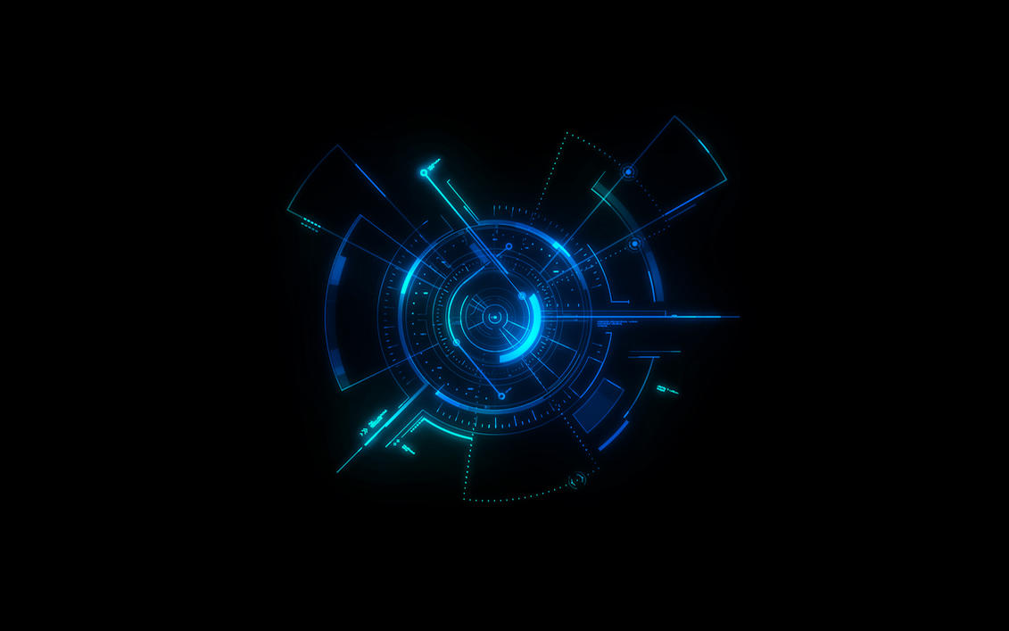
So I've been back to the drawing board... And by drawing board I mean Paint Shop Pro... an older version I like. Here's what I've come up with for the scanner so far. The light blue turns with the ship and the red points at the closest enemy and the dark blue turns with the enemy rotation --so it's very animated and kind of functional too. I'm playing with other shapes for the gauges, but I donno...


It seems like the whole "Iron Man" hud elements have been done to death, but what can I say, they're perdy! The bad part is I get stuck on stuff like this and it brings my development to a halt until I abandon it as "good enough" But I always want to tweak it more.
No comments:
Post a Comment